UX Research & Design
Conversational AI for Patient Education
Building a more immersive and empathetic online patient education experience
Role: Product designer (wearing many hats)
Timeline: 8 Months
Context: CMU MHCI Capstone Project for Client Medrespond
Team: Rayna Allonce, Rufei Fan, Nur Icel, Lily Pai (all product designers)
Impact: generated a preferred future for medrespond product, supported by UX research reports and hifi interactive prototypes
The Challenge
Background
MedRespond is an AI-driven healthcare enterprise product meant to serve as a patient-centered application for health, knowledge, and communication. Their product delivers empathetic, impactful conversations by using video coaching to walk patients through important information that they otherwise may not utilize had they been given a standard print pamphlet or information booklet.
Partnered with MedRespond as part of our graduate capstone project, my team spent 8 months exploring opportunities envisioning a more affective, personalized healthcare experience for patients and caregivers. As the UX Research and Tech lead, I directed our research efforts and encouraged the team to dive deeper into potential hardware solutions in the medical space.
For additional reference, you can follow our journey on Medium or our main project page here.
Problem Statement
How might we envision a preferred future for conversational patient & caregiver engagement that addresses the medical, behavioral, and emotional dimensions of healthcare?
OBJECTives
Evaluate the current MedRespond Experience
Identify opportunities to improve user emotional engagement
Design, prototype, and validate new designs with end users
Define a “preferred future” for MedRespond
The Solution
A new conversational tool that prioritized accessibility, empathy, and collaboration within the patient x caregiver relationship.
Revamping and redesigning an informational tool that holistically addresses patient and health concerns, delivered by an engaging conversational experience.
Select Screens
PROCESS
Pain Points
Over the course of our extensive generative research, we identified several key insights, focusing our scope on the medical journey of the liver transplant patient:
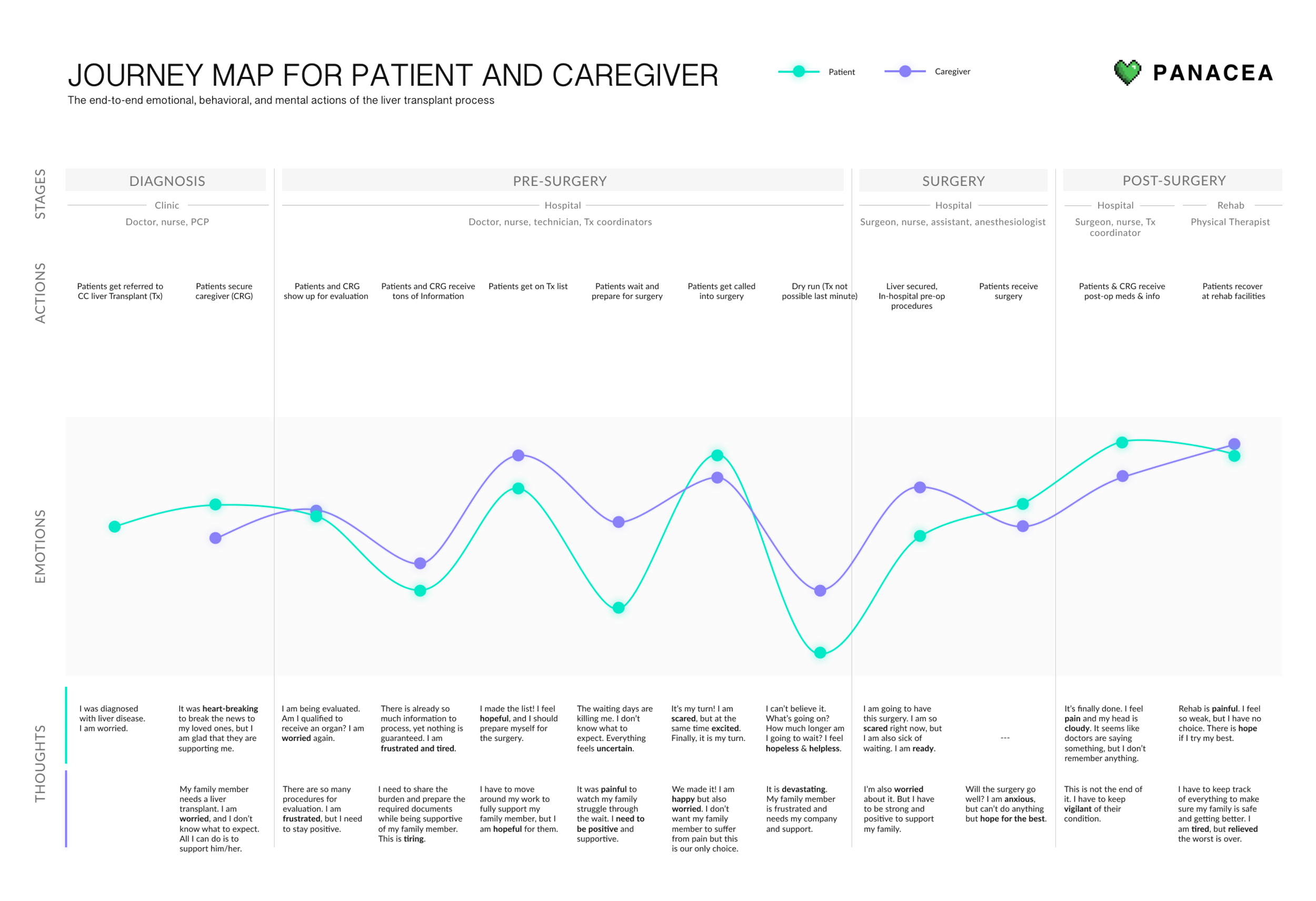
The patient experience is arduous and often unclear. The patient experience throughout the entire journey is filled with long periods of waiting, uncertainty, and logistical challenges. This results in fluctuating levels of emotion and motivation of disease management.
Patients are overwhelmed with and struggle to absorb information. When generally overwhelmed (both emotionally and physically), patients have difficulty processing information due to severe cognitive impairment, medication side effects, and other illnesses.
Caregivers are the most crucial part of the transplant journey. Patients are not even eligible to receive a liver transplant without having a caregiver first, and caregivers shoulder an immense informational and emotional burden.
Both Patient and Caregiver needs must be holistically addressed. Caregivers lives are heavily impacted by the transplant journey as well. Whereas patients shoulder the physical burden, caregivers often shoulder great emotional and mental burden throughout the entire process.
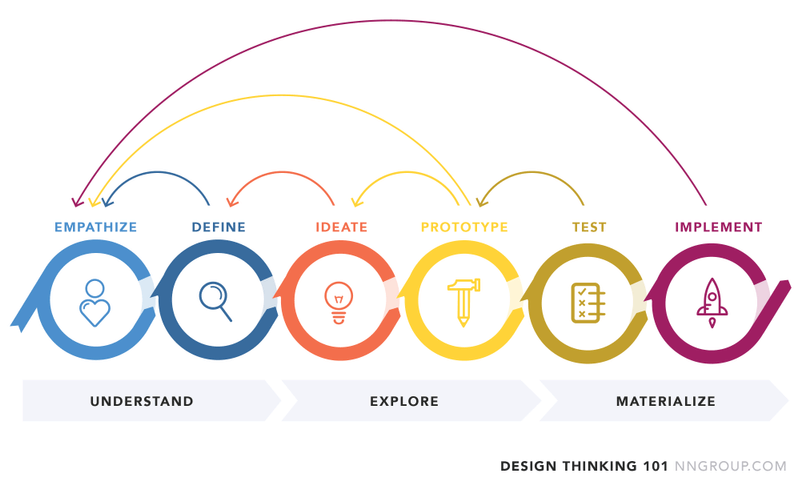
Our project followed NNGroup’s Design Thinking Process, with constant ideation and iteration of our concepts
Research Methodology
Outputs: Early Generative Research Report, Cleveland Clinic Phase 1+2 Research Reports, Spring Research Report
Background Research Methods
Heuristic Evaluation of existing MedRespond platform
Literature Review of current academic research on learning with videos, patient engagement, benefits of patient socialization, etc
Competitive Analysis of existing online patient engagement methods
Log Data Analysis of user interactions from one of MedRespond’s products
Sample from our Heuristic Evaluation
Our team generating new ideas during a Reverse Assumptions workshop
Generative Research Methods
Semi-structured interviews with individuals that had previously gone through any form of surgery
Modeling techniques exploring the patient-caregiver relationship via four all-day team workshops
Affinitizing and synthesizing common themes from user interviews, allowing us to generate insights and further our understanding of the patient problem space
Storyboarding and speed dating new concepts for quick feedback
Usability testing using our Axure prototypes
Evaluative Research Methods
Desirability study comparing our first spring redesigns with the original MedRespond design, asking users to identify thoughts they may have felt when navigating through the design
Think alouds observing how participants complete a given set of tasks within our interactive prototypes
System Usability Survey (SUS) testing to gauge the ease of use of our platforms, performed after think-aloud testing
Bipolar Emotional Testing (BERT) that measured user’s emotional response to our designs, also performed after think-aloud testing
Artifacts
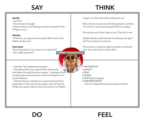
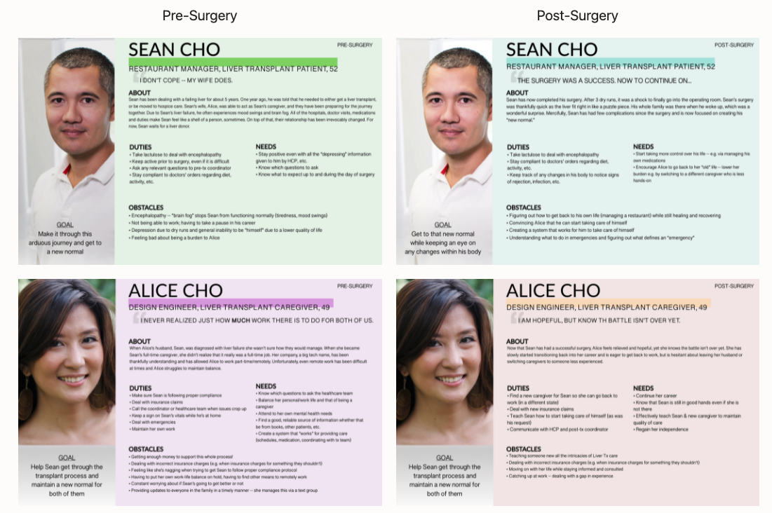
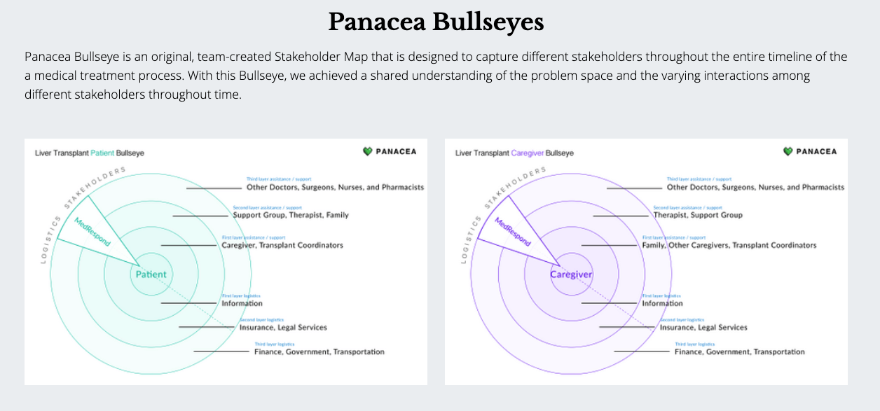
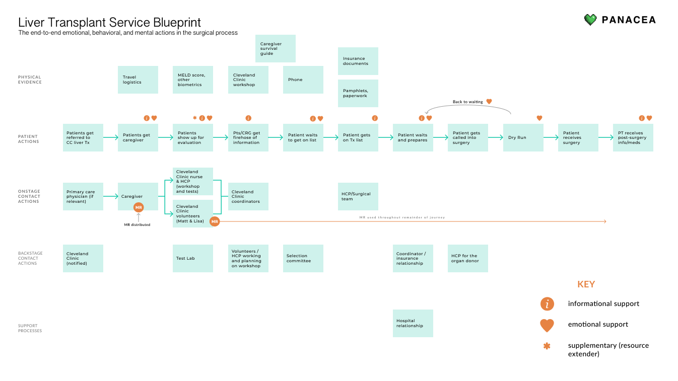
Outputs: Empathy maps, personas, Panacea bullseye (custom stakeholder map), journey maps, service blueprint
Our Design Process
Starting with ideation in the spring, we generated 80 goal-based concepts in 4 full-team design workshops, which helped us tie our research to our design.
In the summer we created over 45 separate parallel prototypes, working in 1-week design sprints to design-evaluate-iterate the following topics
Conversation and Navigation
Onboarding and Emotional Check-In
Note-taking, Resources, and View History
Mobile Adaptations
Desktop Consolidation
Our team using paper prototypes to design the note-taking feature
END RESULT
Final Product Features
At the end of our project, the newly designed MedRespond platform focused on
Conversation
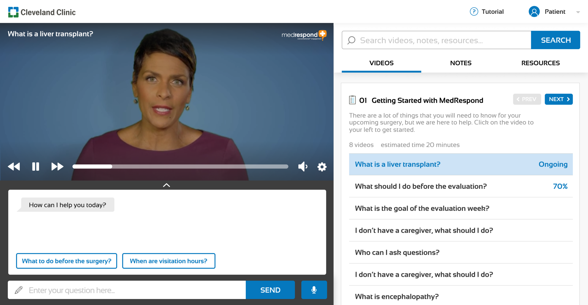
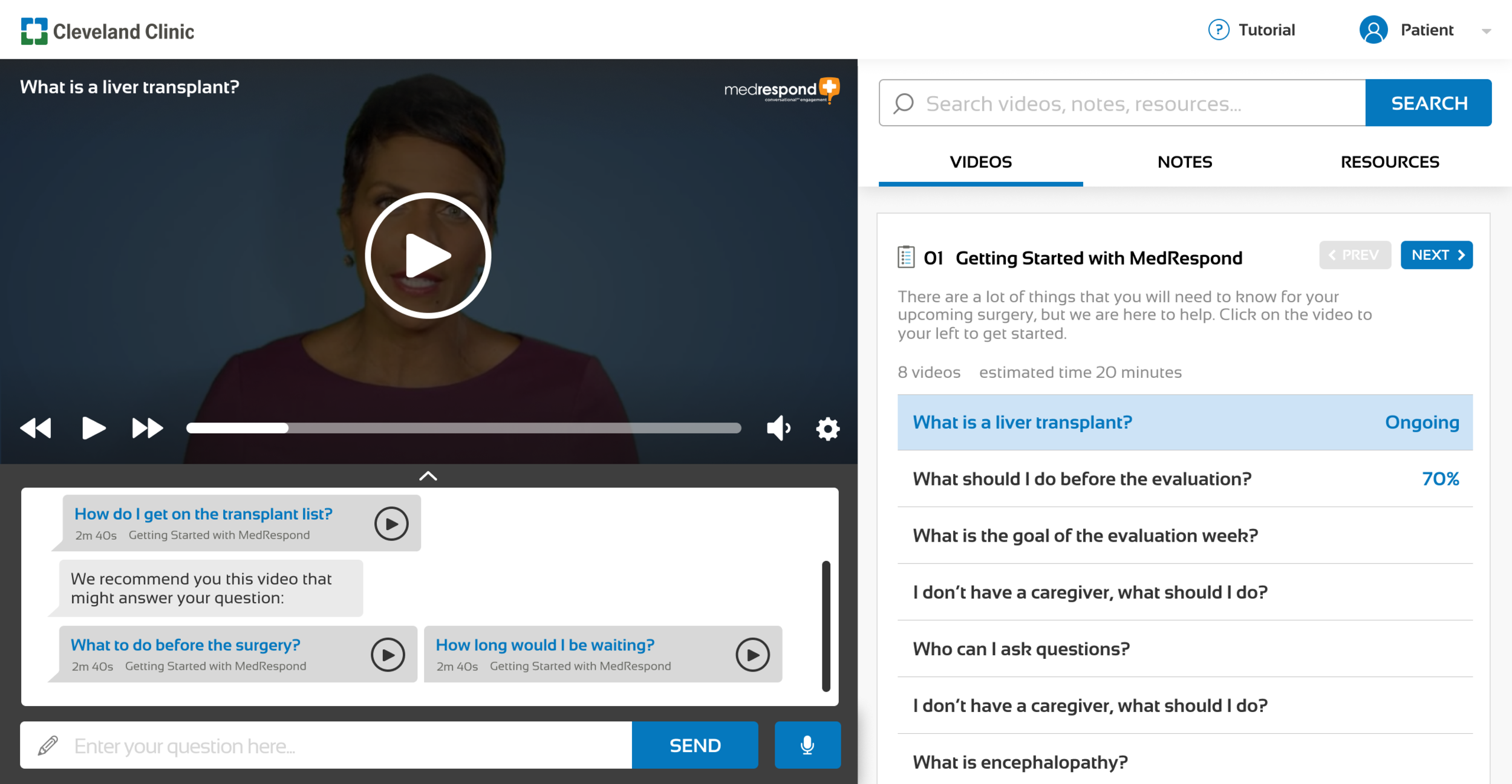
With the rise of conversational design, our goals were to enhance the conversational platform to be more engaging and intuitive, using both elements of conversational interface design as well as high-level visual and interaction design. Featuring elements such as:
- Question input
- Answer input
- Error Recovery
Intuitive Navigation
Intuitive navigation that helps chronologically center the patient in their journey. We designed a Table of Contents module where content is broken down into chapters. This way, users are better able to focus and digest the current chapter without being overwhelmed or distracted by content in other chapters.
A brief chapter overview is also available for users to set expectations and mentally prepare for the upcoming videos. We provide estimated length of each video so that users may plan accordingly.
Resources
A whole additional set of patient and caregiver tools exists within the new platform. Including:
- My Care Team Overview (pictured)
- Our Primary Resources page with important contacts
- Flexible shared account navigation between the patient and caregiver
Dynamic Transcript
A necessary accessibility feature made more digestible.
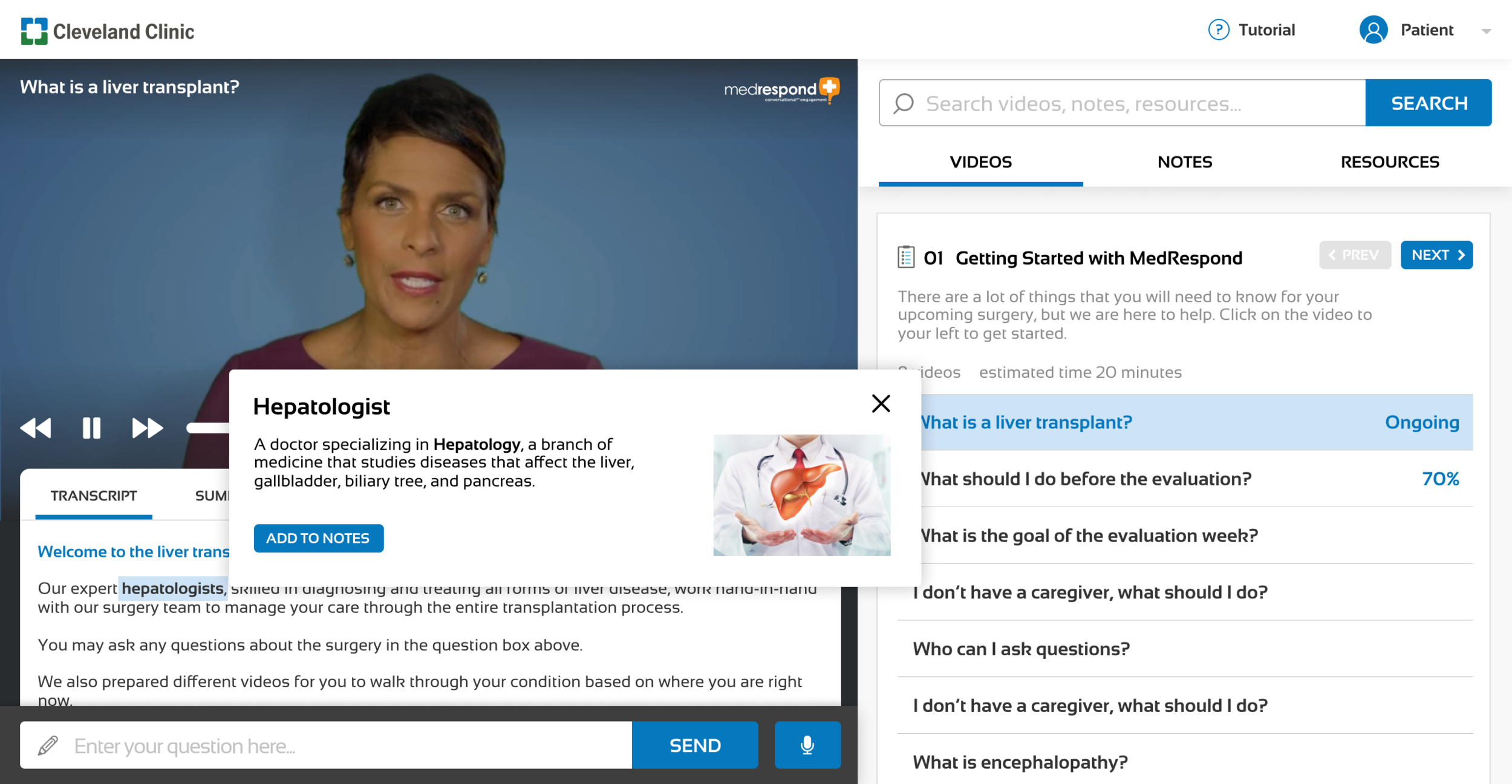
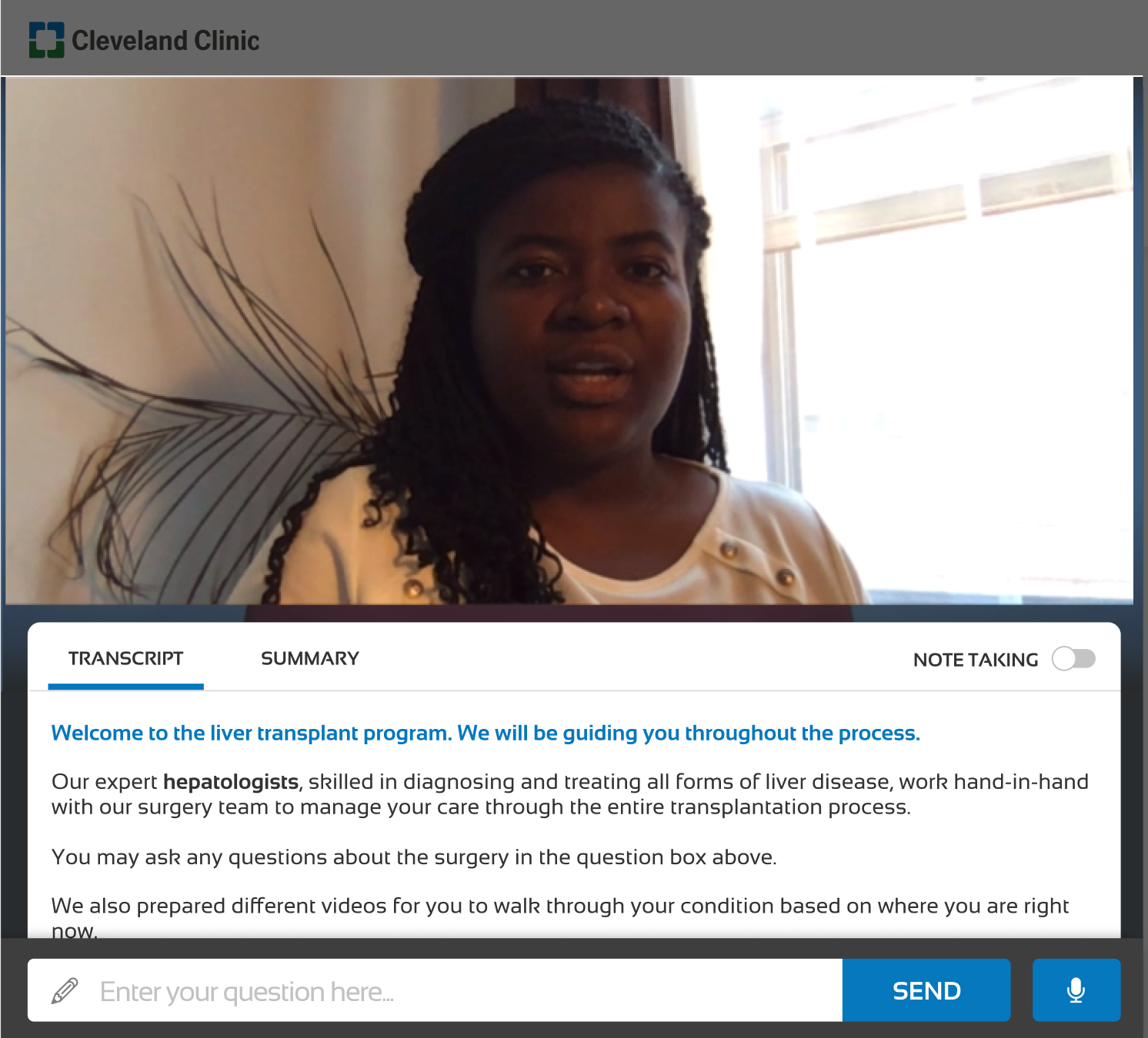
Based on competitive analysis of online learning platforms and our heuristic evaluations, syncing transcript to the video provides greater flexibility, efficiency of use, and fulfills accessibility standards by allowing users to reinforce what they are watching through what they are reading.
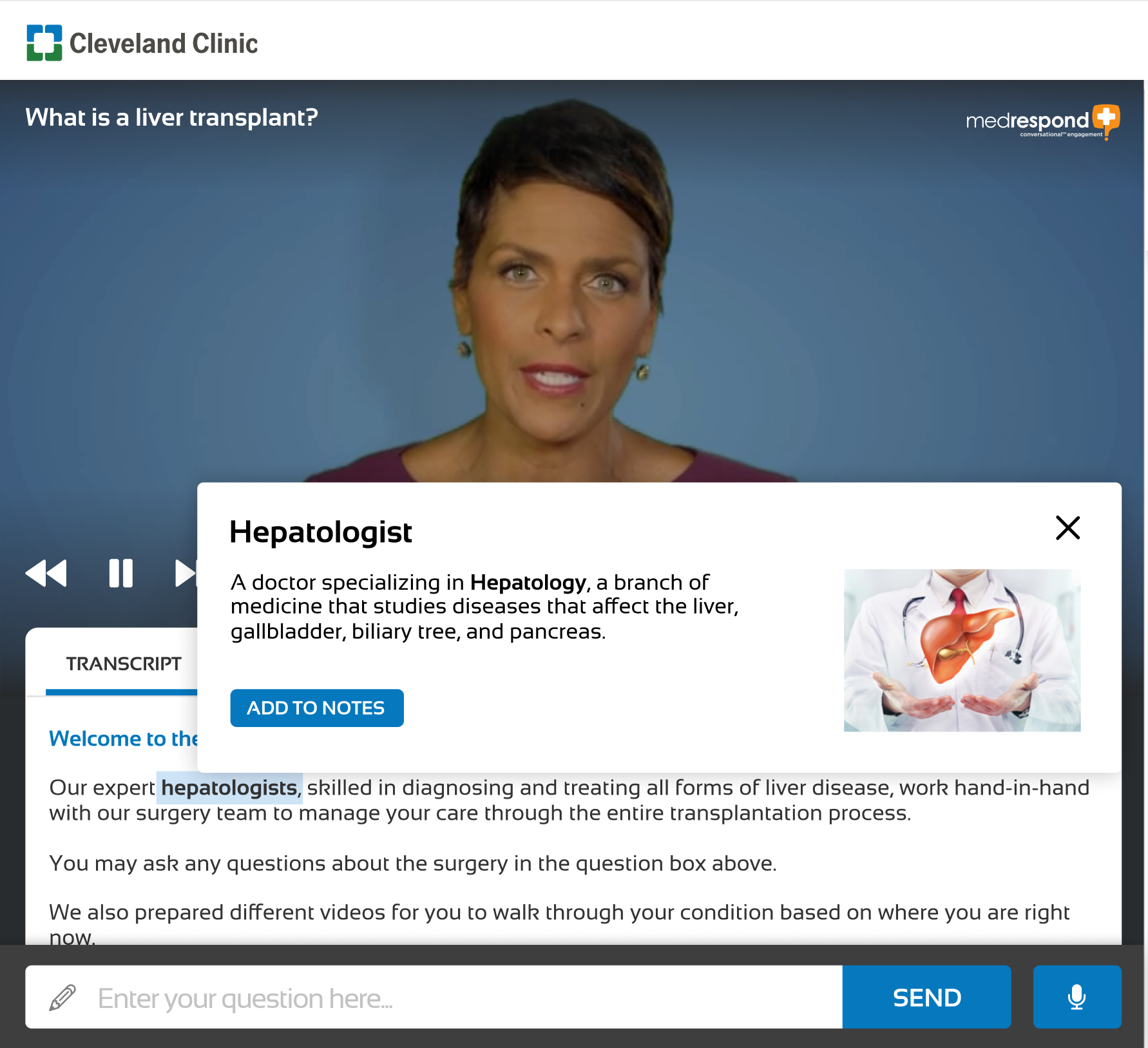
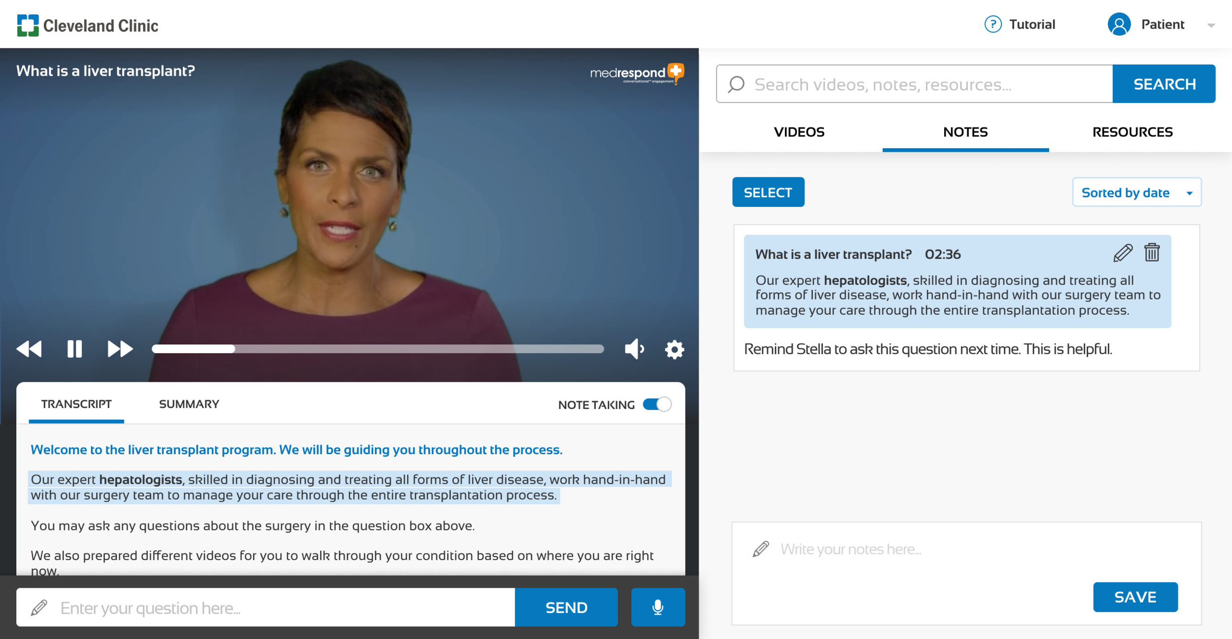
Also noted in this platform is the use of interactive terminology within the transcript. Users can look up terms in situ while learning, and add them to their notes for later review.
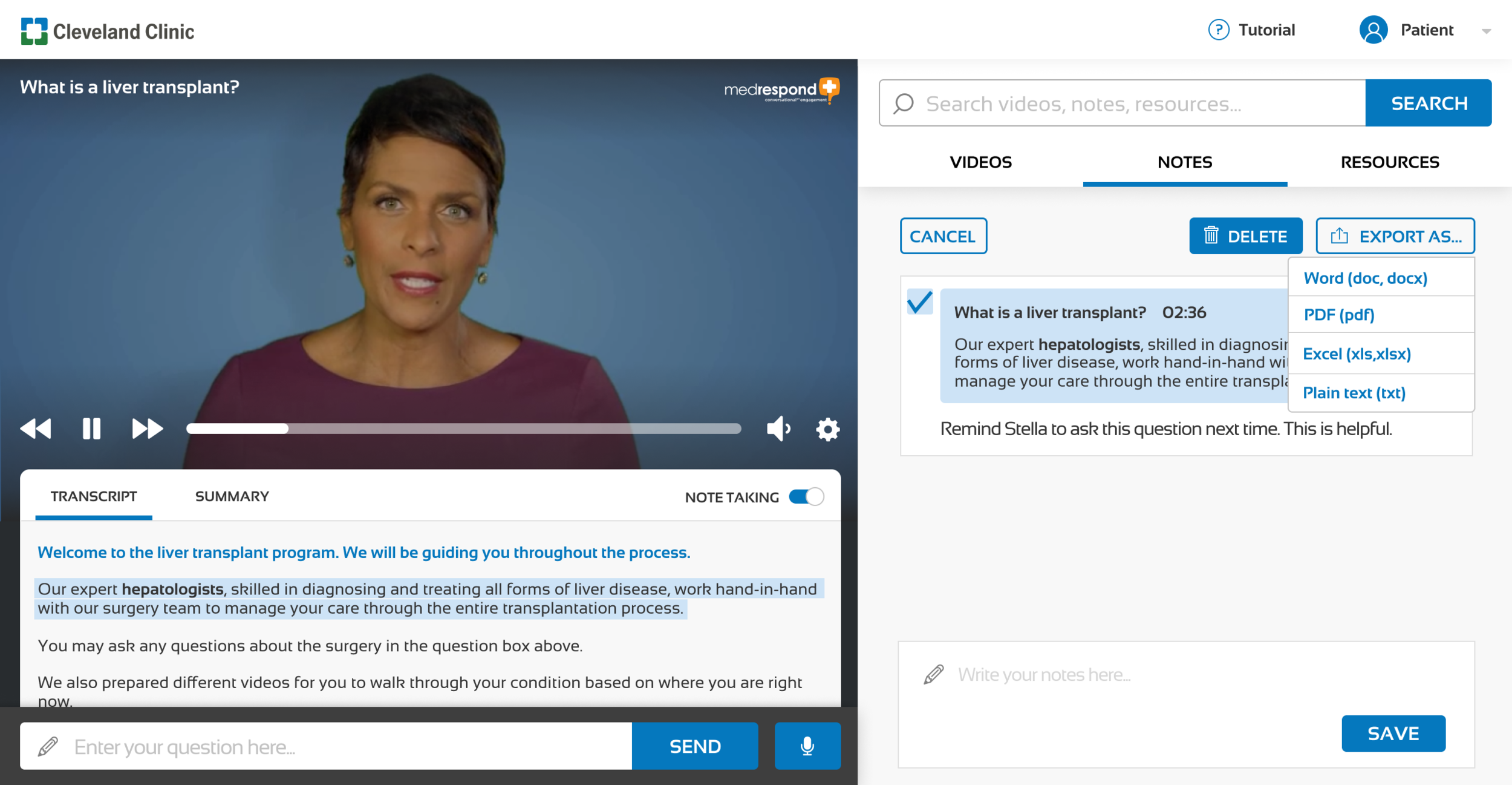
Note-Taking
From our research surrounding patient-doctor communication, we learned that when answering questions, patients often need to stop and ask about specific jargon or medical terminology.
Note-taking behavior is prevalent among patients & caregivers. In Note-taking mode, the user can highlight portions of the transcript / summary and add notes.
Onboarding
Onboarding helps users feel validated and better understand the MedRespond platform.
Early on, we identified onboarding as a key first touchpoint to both making the user feel welcomed and comfortable using the platform.
In order to provide a tailored experience where the specific emotional and informational needs of patients and caregivers can be both tracked and met by the platform, we now ask users to identify themselves as a patient or caregiver at the beginning of onboarding.
🔑 Key Elements of Future Product Vision
Major Usability Improvement — Implementation of some simple changes to make the content more accessible to users of varying cognitive ability (ex: inclusion of an interactive transcript, closed captions, autoplay)
Active Emotional Support — Through the course of the project, we have focused on how to make the user feel loved through the MedRespond platform. We aim to explore emotional engagement through
Careful weaving of patient stories/testimonials within the content
Patient or caregiver-specific tools for their specific emotional needs
Engaging with outside support groups or transplant communities.
Mobile Experience Optimization — Users are increasingly using mobile devices to retrieve information and are often more comfortable using devices familiar to them (such as their smartphones) to navigate new platforms. It is imperative that the MedRespond mobile experience feel as user-friendly as the desktop version.
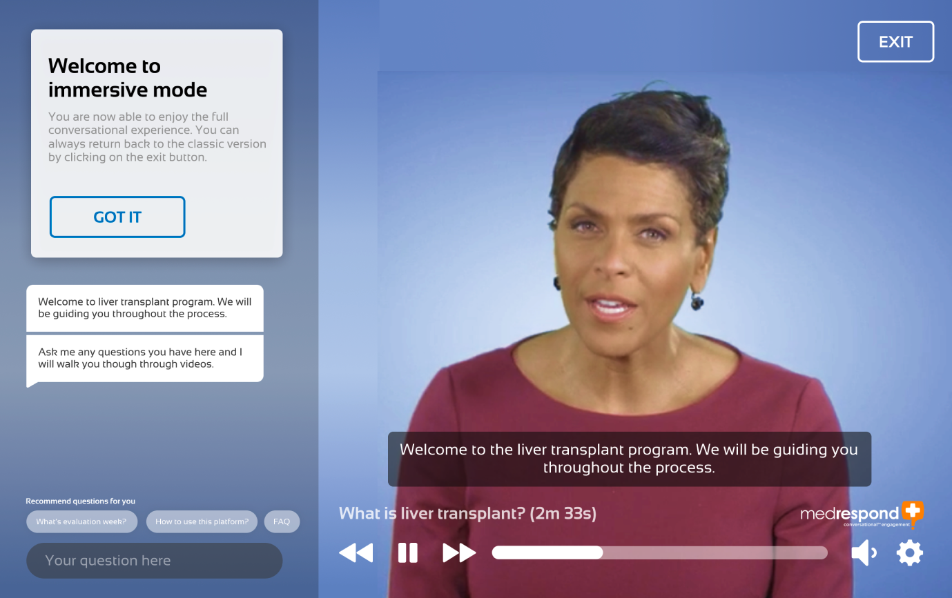
Immersive Conversational Engagement — One concept born of our numerous design sessions was immersive mode, a watch mode that’s fully video focused, allowing the user to plug in completely. Future immersive methods could include AR/VR, VUI, or Kinect compatibility for physical therapy training.
Immersive mode allows the patient to focus on the content alone, asking questions in context.
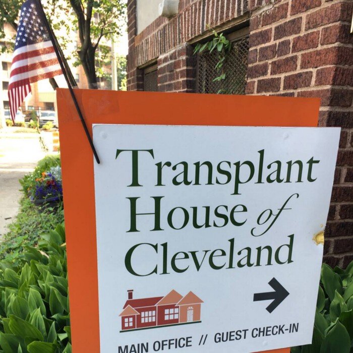
Our team goes onsite to test with transplant patients at the Transplant House of Cleveland
Impact
From our usability testing sessions with transplant patients at a local transplant facility, our final prototypes performed well overall, hitting the following metrics:
Average System Usability Scale score of 77 (industry average = 68)
80% of tested users felt they were able to learn the system quickly
86% of tested users felt they would like to use the system frequently
92% of tested users felt the system was easy to use
Strongly associated the system with being “high quality”, “professional”, “friendly”
Overall, this capstone project was positively received by our stakeholders, with plans to implement some of our usability recommendations and caregiver specific programming as soon as possible.
Reflection
This capstone project was our defining rite of passage as part of the MHCI experience, equal parts terrifying and exhilarating. In eight short months, we learned a ton about UX, project management, and collaboration and came out of the program ready to take on the real world. Here were some of my key takeaways:
Be resourceful — There’s something to be said about approaching problems with a “broke grad student” mentality. It forces you to think scrappy and outside of the box. Never be afraid to ask for help from a colleague or faculty member — the worst thing someone can say is no.
Roll with the punches — Be flexible in the face of your assumptions changing based on research or testing results. Don’t be afraid to blow up your old designs when the time calls for it.
Take breaks — Seriously! Our team made sure to set aside time for ourselves, be it attending fitness classes, working from home, or even coordinated team activities together. The capstone project is meant to simulate a “real-world” job, but that doesn’t mean you can’t have some fun while doing it.
Cheesing with the team at the Cleveland Museum of Art

